Well, I hadn’t planned to swatch the new StrangeBeautiful colors, but rather share them with you as I wore them, but demand was popular enough, so I got up early this morning and swatched them, one per finger, for your viewing pleasure!
First off, I have to say that this round the formula feels a bit more runny to me. Nothing horrible; I mean, I didn’t get little drops of polish flicked on my clothes or anything (Hi, Nixxy!); but a bit more thin than I remember the last collection being.
Also, some of the colors needed two coats, and that’s a first for me with the SBs. But, overall, I’m very pleased, very pleased.
These can be purchased from Bergdorf Goodman or lucky scent, but remember that this is a marrying collection. You can’t just date which colors you want; take them all or let them go.
[In other words, you have to purchase the entire “library of color.”]
As they have no names, I’ll give you the breakdown by (my) numbers, left to right, of the colors you saw above.
The bottle shots are indoors, all others in the ‘shine. They also all include a base and top coat. I didn’t plan to at first, but then I thought, “Oh, what the hey!”
And one other thing: One of these bottles was hard to open. No, wait, let me rephrase. One bottle was im-poss-sible to open! I tried everything I could think of, but it was a no go. Eventually, I had to resort to, um, unorthodox means to open it. Let’s see if you can figure out which one it was in the following bottle pics. . . .
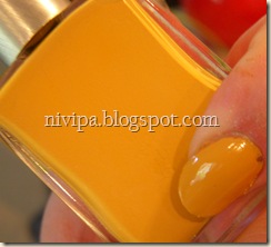
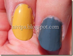
#1 – a mustard yellow. A near-dupe or a dead-on dupe for OPI’s The “It” Color, judging from looking at the bottle and painted nail. The SB may be a little paler. (I have not yet worn the OPI, so I cannot compare applications.)
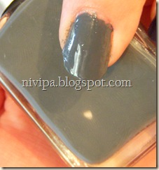
#2 – a blue-tinged concrete grey. It’s the current leader in the Color of the Month poll (have you voted yet?). It makes me think of the uniforms of the American Civil War, between the blues and the greys (the North and South, respectively).
#3 – a dark, inky blue with a purple cast to it. This one surprised me by how much purple was evident in it as I was applying it. I liked the color in the bottle, but putting it on . . . WOW, I’m in love. And this is one coat. Yup, one. I was ready to apply a second but, as I looked at it, I thought, “Why bother?”
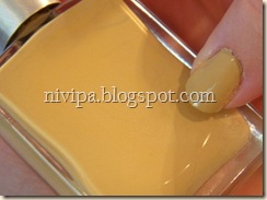
#4 – I’ve gone through ecru, beige, and ivory, and none of them seem quite right; it’s got a slightly more yellowish tone than any of those. Even old parchment doesn’t seem to describe it quite right.
#5 – heavily brown-toned red. I’m almost tempted to call this a muted brick, but luckily this is one of the colors I know where the genesis sprang from specifically: the dull red shell of a lobster.
#6 – yellow-toned medium brown. This is the color I’m feeling “iffiest” about. At one coat this color looked nasty. Two’s better, but I’m reserving my judgment until I do a full mani with it. Hmm. . . .
#7 – this one I feel safe calling “beige.” Like the colors described above and below, these are not even close to being a one-coater, like all of the other SBs I’ve worn/tried. Two comes out quite well, though.
#8 – a slightly dirty sea foam color. As would probably come as a surprise to anyone who’s seen my varnish collection, I actually love the earth tone colors. But then again, it wasn’t until recently that colors like that were even released in polish form. Glad to expand my options :)
I’m liking the mix in this collection; some colors are very vivid and noticeable, and some are very subtle. A nice mix, I think. The muted colors remind me of The Corpse Bride. Other than the bright blue corpse, of course.
But wait – THERE’S MORE!
A special offer, for today only, at Lucy’s request I am adding in a shot of Femme Fatale, the less-than-stellar star of this post, this time over a coat of black lacquer.
(This picture I forced out of focus with my plant. I’d meant to crop it, but I kind of like it, so I left it :)
This is one coat over one coat of Sally Hansen’s Black Out from the Xtreme Wear collection. (I got that because CVS was putting on clearance any white-capped SH XW polishes, and I figured, who couldn’t use an extra black? I’m pleased as one coat was quite sufficient!)
So there you have it; the first quick-and-dirty review and swatches of the second Library of Color.
Have a great weekend, everybody!


I love those shades in the Library of Color. Very nice and different. # 2 and # 8 are my favorites, but I really like them all. I'll have to check it out at Nordstrom's.
ReplyDeleteI really enjoy the shades too, though, as I said, I'm holding back on one of them - but I like to get a full mani a few hours' chance :)
ReplyDeleteThey are still available at Neiman Marcus for $79 for each library. I'm glad you've swapped them. Mine are still packed away and I can't get to them. I saw them on their web site and had to have them. I just thought the colors were amazing. I love the whole package of them.
ReplyDeleteI had the same reaction you did, starting at the first library. These are colors that are very well thought-out and developed. And I didn't know NM carried them; thanks for letting me know!
ReplyDelete