
.JPG)
Recently, I needed to go to a meeting I didn’t really want to go to; one dealing with my mom’s estate. Emotionally, I was feeling very vulnerable, small, and scared.
So I needed to get some emotional armor on.
Even though I would not be working, I chose to wear formal clothes, which I never do when I don’t have to. My favorite pair of plum trousers were even a part of it. Check.
I don’t often wear perfume, but this is one instance when it was a good idea to. Some of my favorite Givenchy. Check.
But what about my nails?
I kid you not, I actually spent a good deal of time debating on what color to wear days ahead of time. But this thought process was mostly on my mental back-burner.
At first I thought of holographics, as those are my favorite finish. However, I knew that while looking down at my nails would make me smile, it was also a little more loud and celebratory for the tone of the meeting.
I could wear a StrangeBeautiful - as I’ve said, they make me feel very chic - but I just wasn’t feeling it.
There’s Essie’s Love, Beverly Hills xx, but red just didn’t seem to be the right color. I wanted something to make me smile, but something that could also be understated.
The final decision? Chanel’s Kaleidoscope.

I first made the acquaintance of this color on Stephanie’s Polish Addict. But twenty dollars for a Chanel seemed pretty steep. (Hah! They’re routinely up to thirty now; what was I complaining about?) So I hemmed and I hawed, and I hawed and I hemmed.
But the more I read about this color, the stronger my lemming became, As it was released at the same time as Gold Fiction, you often saw the two talked about in the same post. And people such as Scrangie were often saying the twenty-dollar price tag for Kaleidoscope was worth it; the thirty-dollar one for GF was not.
So, in a fit of madness (and with a rare discount as I had opened a Macy’s card the same day), I bought my first (and, to date, only) Chanel.

And when I first put it on, I was disappointed. I know, it’s a gorgeous color – what was I thinking?
Well, I think that when I looked on others’ blogs, it looked a lot more silver to me. On my hands it definitely had more of a golden/olive thing going on. (Maybe that’s why it’s called “Kaleidoscope”; as soon as you think you’ve got a description pegged down, it turns a bit and changes on you!) I honestly thought that I had made some kind of terrible error in putting this on because it didn’t look like I expected it to.
Fortunately, I dropped my comparisons and just learned to appreciate the color for what it was.

(That thick, boxy cap comes off; this is the size of the handle you paint with.)
This is three coats, by the way. It really would have been fine at two, but as I was applying to my dominant hand, I caused a dent in the polish of my non-dominant, so I had to apply a third to try and save it. The application was very nice, even if I was applying coats a little bit thicker than I’d’ve liked.
This is almost certainly a metallic with shimmer, and it is even somewhat reflective. Wearing a black top, I can see that color reflected in my nails. I’m sure it’s not Maybelline’s Mirror Image by a long shot, but it’s certainly somewhat akin to it.
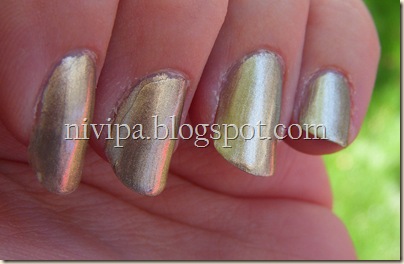
(You can see the red curb reflected in two of my nails above.)
For those of you who have not heard of this little factoid yet, Chanels are pretty darn famous for their lack of durability. I honestly can’t remember what the wear was the last time I wore this, but none of my polishes usually lasted long, as I hadn’t yet developed any techniques for applying varnish.

But since I am now (slightly) older and (moderately) wiser, I know to expect chipping, and soon. Believe it or not, I often leave colors on for anywhere from three to five days (gasp!), so that’s actually an important consideration to keep in mind.
Thankfully, Nora at Nail of the Week did a top coat comparison on Chanel lacquers. The winner was CND Air Dry. So, based on her recommendation, I added a bottle to a recent online order, and that’s what’s gone on top. It actually worked really, really well, and I only found a slight chip in one nail about day three or four.
I’ve tried finding some image to compare the color to, but I lack the appropriate adjectives to find it. Humph. But looking for a clip has yielded just what I need. Not only is this exactly what it made me feel like – strong and capable of deflecting negativity with my indestructible bracelets, but her crown and wrist guards, while not identical to the color, certainly put me In mind of it!

Well, Kaleidoscope gave me just what I needed it to. It was my armor that I required, a beautiful color that’s not going to go unnoticed, per se, but also one that’s not going to shout, “Party Time!” either. A well-made choice, I think.

Looking back at these pictures makes me long to wear it again. And you can see how much it changes, depending on the light. That’s why I compared Molten Metal to it in its inability to be defined. My favorite shot of it, though, you might recognize as my current ID photo. It’s taken at sunset.

How about any of the rest of you? Do you have a color, brand, finish, or specific polish you use as your shield?


